Alright let’s talk about the 2024-2025 NBA City edition jerseys.
Quite frankly, most of them stink.
After years of jerseys that actually showed some creativity and thought put into the design, Nike is kinda just…farting around and putting out the lamest jerseys I think I’ve seen, especially for the historic franchises. As a Miami Heat fan, it’s brutal to look at these uniforms and think that any creativity was put into them. You can’t fool me, I know your game.
So here we are, placing these jerseys into tier for the 2024 season. Keep in mind, that a B-tier this year might not be a B-tier in years before, same as with every tier. With that said, let’s break down these jerseys. Lord help me.
S-Tier
Toronto Raptors
:format(webp):no_upscale()/cdn.vox-cdn.com/uploads/chorus_asset/file/25629650/GXtkGRXakAAh5O3.jpg)
DINO DUNKING (clap, clap, clap-clap-clap)! DINO DUNKING (clap, clap, clap-clap-clap)! An incredibly cool way to pay homage to the old dino jerseys and Raptors legend Vince Carter at the same time. Easily the best of the bunch this year.
A-Tier
Houston Rockets
:format(webp):no_upscale()/cdn.vox-cdn.com/uploads/chorus_asset/file/25629671/GXth_8_akAA3qeo.jpg)
I actually really like the small additions of gold here, without losing sight of the team’s actual colors. I love the bold font on the front of the jersey and even the little “Believe it! Again!” insignia on the bottom left corner. Is it a little bland? Sure, but I think the simplicity makes this work a lot.
Detroit Pistons
:format(webp):no_upscale()/cdn.vox-cdn.com/uploads/chorus_asset/file/25629704/GXth4c4bkAA_FwG.jpg)
I actually love the font on the front of the jerseys. Again, it’s very simple, but its an effective look that’ll more than likely be highlighted by the numbers as well. The cream color jersey works really well, and I like the complement of colors. I wanna see it with the numbers, though.
San Antonio Spurs
:format(webp):no_upscale()/cdn.vox-cdn.com/uploads/chorus_asset/file/25629716/GXtkCPLbYAA___o.jpg)
The Spurs always knock their city edition jerseys out the park, and this year is no different. I’m a sucker for baby blue jerseys, and the font on this one is so creative, but still able to be seen from someone in the crowd. Love the collar too.
Phoenix Suns
:format(webp):no_upscale()/cdn.vox-cdn.com/uploads/chorus_asset/file/25629720/GXtj2ZmakAAYmgD.jpg)
These kinda rule! The font on the front kicks ass, and I love the trim on the side of the jerseys. They also don’t really lose sight of their own team colors with the purple and orange, but the small addition of green here makes it pop out. The star might be a little much, but I need to see it with a jersey number to really figure out.
B-Tier
Washington Wizards
:format(webp):no_upscale()/cdn.vox-cdn.com/uploads/chorus_asset/file/25629730/GXtkMIdaYAAOh_V.jpg)
I REALLY like the front of this jersey. I think the District font is so creative and a really cool thing to put on a jersey for someone to wear outside. The problem is that I’m not sure you’ll really be able to notice it during a game. Also, the collar is cool, but I wish there was a bit more red to tie in that font. Still a solid jersey though.
Utah Jazz
:format(webp):no_upscale()/cdn.vox-cdn.com/uploads/chorus_asset/file/25629734/GXtkJdtakAATu_X.jpg)
Love the font, love the mountain range on the front of the jersey. I just wish they did more with the trim to tie it all together. Still a good jersey.
Memphis Grizzlies
:format(webp):no_upscale()/cdn.vox-cdn.com/uploads/chorus_asset/file/25629738/GXtjK0tbkAAwOpn.jpg)
This would be in S-tier if I was only ranking based on a normal person wearing this in their day to day. I love the bright, vibrant colors here. The problem is I think the font is too close and squished together that it might not be noticeable on the court. I’d wear it outside though.
Golden State Warriors
:format(webp):no_upscale()/cdn.vox-cdn.com/uploads/chorus_asset/file/25629808/GXth9xSakAELH_y.jpg)
I like how they made the Golden State circular around the number, and the drape design is actually pretty cool here. It’s a good jersey.
C-Tier
Sacramento Kings
:format(webp):no_upscale()/cdn.vox-cdn.com/uploads/chorus_asset/file/25629754/GXtj82BakAExy8A.jpg)
It’s a little bland, but the simplicity might work with the jersey numbers when it comes in. The Captain America Kings get a pass from me.
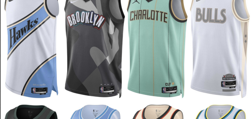
Charlotte Hornets
:format(webp):no_upscale()/cdn.vox-cdn.com/uploads/chorus_asset/file/25629758/GXthxAbakAAzeb6.jpg)
Again, it just feels simple to me. I’m glad they got rid of Buzz City, but this just feels incomplete. I know it’s missing the numbers, but even outside of that. It feels rushed out.
Indiana Pacers
:format(webp):no_upscale()/cdn.vox-cdn.com/uploads/chorus_asset/file/25629765/GXtii7OakAMkFf7_1.jpg)
I like this better on the white jersey than the black jersey. It still looks like it was made in MS Paint but it’s an improvement!
Portland Trail Blazers
:format(webp):no_upscale()/cdn.vox-cdn.com/uploads/chorus_asset/file/25629767/GXtj5FjakAEwktH.jpg)
I feel like the Blazers have worn this jersey before, which is never a good sign with new City edition jerseys.
Cleveland Cavaliers
:format(webp):no_upscale()/cdn.vox-cdn.com/uploads/chorus_asset/file/25629768/GXthyhnaUAAquiF.jpg)
Man I REALLY want to like these, and I would wear this one outside, but the font has too much white, which on a baby blue background it just looks difficult to see. I also don’t like the trim on the sides. Feel like that was a misstep.
Atlanta Hawks
:format(webp):no_upscale()/cdn.vox-cdn.com/uploads/chorus_asset/file/25629771/GXthvCNakAAaycs.jpg)
I normally like the Hawks’ jerseys, which makes me disappointed to put it this low. I don’t like all the stripes at all. There’s just a lot going on with this jersey, and the “Hawks” going diagonally across the front is also weird.
Philadelphia 76ers
:format(webp):no_upscale()/cdn.vox-cdn.com/uploads/chorus_asset/file/25629752/GXtjzPmaAAAL0vv.jpg)
Cool font, like the trim on the sides. This feels like a normal Sixers jersey, so I can’t put them higher. But it’s still solid.
:format(webp):no_upscale()/cdn.vox-cdn.com/uploads/chorus_asset/file/25629816/GXthzIaakAEyyh6.jpg)
I love the trim on the sides, and I love the font. Why is it in C-tier? Because how do you take a team that wears different shades of blue and give them white and gray? What kind of sense does that make?
D-Tier
Minnesota Timberwolves
:format(webp):no_upscale()/cdn.vox-cdn.com/uploads/chorus_asset/file/25629747/GXtjfATakAAlwwF.jpg)
I want to like these more than I actually do. I actually think the background, while basic as hell, is pretty dope. The font on the front is so, so small though. It feels unfinished.
New Orleans Pelicans
:format(webp):no_upscale()/cdn.vox-cdn.com/uploads/chorus_asset/file/25629741/GXtjkS5bQAAhR_w.jpg)
This looks like a Pelicans’ jersey you’d order off Temu. The background is also really weird. If it weren’t for the font of the NOLA up front, this would be lower.
Brooklyn Nets
:format(webp):no_upscale()/cdn.vox-cdn.com/uploads/chorus_asset/file/25629781/GXthwYIbsAAcx_U.jpg)
…At least the font is cool?
Denver Nuggets
:format(webp):no_upscale()/cdn.vox-cdn.com/uploads/chorus_asset/file/25629783/GXthzr5akAEXZbm.jpg)
I’m not sure if that’s supposed to be a heat or altitude map on the sides, but I like it! That’s…about it. Get the 5280 off the front of the jersey please.
Milwaukee Bucks
:format(webp):no_upscale()/cdn.vox-cdn.com/uploads/chorus_asset/file/25629785/GXtjOZHbUAAE31s.jpg)
“I’m blue Da ba dee da ba diDa ba dee da ba di da…”
Orlando Magic
:format(webp):no_upscale()/cdn.vox-cdn.com/uploads/chorus_asset/file/25629792/GXtjuoobwAAuJh1.jpg)
“Ok so how do we make a team with the coolest font and most vibrant colors boring as hell?”
Los Angeles Clippers
:format(webp):no_upscale()/cdn.vox-cdn.com/uploads/chorus_asset/file/25629794/GXtiu15akAEfebS.jpg)
“Graphic design is my passion!”
Chicago Bulls
:format(webp):no_upscale()/cdn.vox-cdn.com/uploads/chorus_asset/file/25629817/GXthxvWawAA0Z8w.jpg)
For a team and a city with as much history and passion with the color red involved, this feels like a disservice. Use the Chicago flag! The answers are there, but you’re in the wrong textbook.
F-Tier
Boston Celtics
:format(webp):no_upscale()/cdn.vox-cdn.com/uploads/chorus_asset/file/25629795/GXthvumakAA3VEa.jpg)
I’m actually stunned at how little effort was put into a jersey of a team with as much prominence in the NBA as the Celtics. This looks like a poorly designed rec league jersey.
Los Angeles Lakers
:format(webp):no_upscale()/cdn.vox-cdn.com/uploads/chorus_asset/file/25629798/GXtizknaUAA5qHf.jpg)
It’s like they didn’t even try to do something creative. Just slapped on a gradient and went on break for 6 hours.
New York Knicks
:format(webp):no_upscale()/cdn.vox-cdn.com/uploads/chorus_asset/file/25629799/GXtjm_2akAIEeF_.jpg)
This looks like a psychiatry test gone wrong.
Oklahoma City Thunder
:format(webp):no_upscale()/cdn.vox-cdn.com/uploads/chorus_asset/file/25629801/GXtjrvzaoAAhB29.jpg)
(bangs head into keyboard).
Miami Heat
:format(webp):no_upscale()/cdn.vox-cdn.com/uploads/chorus_asset/file/25629811/GXtYtzgWMAArPTT.jpg)
:format(webp):no_upscale()/cdn.vox-cdn.com/uploads/chorus_asset/file/25629814/940udl.jpg)